The Evolution of the PSG Crest
1970-1972

1972-1982
1982-1986

1986-1987

1987-1990

1990-1992

1992-1996

1996-2002

2002-2013

2013...
Paris Saint-Germain Crest 1970 to 1972

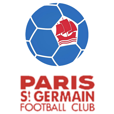
Of all the major clubs in world football, Paris Saint-Germain are one of most recently formed, the merger of Paris FC and Stade Saint-Germain creating the new club in 1970. The first crest was a blue football with a red ship in one of the panels, the ship being one of the symbols on the city's coat of arms.
Paris Saint-Germain Crest 1972 to 1982

It wasn't long before Paris Saint-Germain were having to think up a new crest, Paris FC splitting away from the club that only two years earlier they'd help form. So, in 1972, Paris Saint-Germain retained their name but changed their crest, coming up with the first version of their now iconic Eiffel Tower design. As well as the striking blue, red and white colours that formed the city's most iconic landmark, the new Paris Saint-Germain crest also featured a fleur-de-lys and a cradle, both of which were taken from the coat of arms of the commune of Saint-Germain-en-Laye, a nod to the original Stade Saint-Germain club.
Paris Saint-Germain Crest 1982 to 1986

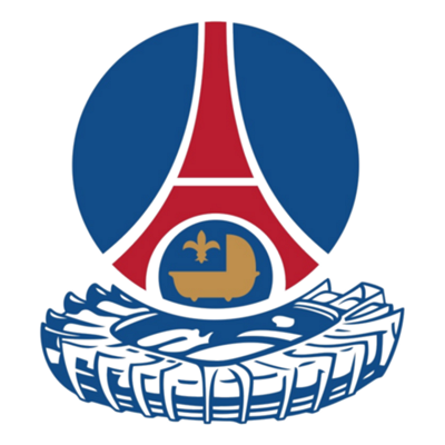
Next up, in 1982, was a really unusual addition to a football crest - the club's stadium. Yes, someone came up with the novel idea of adding the Parc des Princes to the design, positioning it below the previous logo to create a new one.
It probably shouldn't have worked, but it kind of did!
Paris Saint-Germain Crest 1986 to 1987

Another unusual change to the Paris Saint-Germain crest took place in 1986. The city of Paris was bidding to host the 1992 Olympics, so, in order to show solidarity and support, the club decided to temporarily adopt the official logo on their shirts. Then, the following season, 1986-87, Paris Saint-Germain changed their crest so it closely resembled the Eiffel Tower graphic that had been used in the Olympic bid.
Paris Saint-Germain Crest 1987 to 1990

After the International Olympic Committee awarded the 1992 games to Barcelona, Paris Saint-Germain dropped the Olympic bid logo and went back to the previous version with the symbol of the Parc des Princes on it.
Paris Saint-Germain Crest 1990 to 1992

The Parc des Princes was dropped from the logo in 1990, eight years after it had first been used, as the club went back yet again and adopted another of its old logos, this time opting to re-use the classic design that they'd used from 1972 to 1982.
Paris Saint-Germain Crest 1992 to 1996

Having played it safe by reverting to previous crests, things were about to change dramatically. 1991 had seen Paris Saint-Germain bought out by Canal+, the French TV company, who were looking for Paris Saint-Germain to challenge Marseille and to try and rekindle public interest in Ligue 1.
One of the first things they decided to do, in 1992, was radically change the club's logo. The artistic director of Canal+, Étienne Robial, came up with new design, abandoning the Eiffel Tower and going for huge P-S-G lettering. It didn't really look like a football crest and the fans didn't like it. However, we now look back on it as a bit of a cult design amongst 1990s football crests.
It was also the crest that was worn as Paris Saint-Germain became French league champions for the first time in nine seasons, as they comfortably beat Marseille to the Ligue 1 title in 1994.
Paris Saint-Germain Crest 1996 to 2002

After a few seasons with the new style of logo, Paris Saint-Germain went back to the tried and trusted Eiffel Tower design in 1996. The cradle and fleur-de-lys were back, and this time they also added a couple of extra details, with a band around the edge, the year the club was formed, 1970, placed at the bottom, and the club name, Paris Saint-Germain, around the top.
No matter what you think of Paris Saint-Germain, this was a good looking crest!
Paris Saint-Germain Crest 2002 to 2013

2002 saw the crest changed slightly. The basics of the design remained, with the Eiffel Tower, cradle and fleur-de-lys all remaining, but the colours were changed slightly as a deeper blue was used and the outer border was changed from white to blue.
Paris Saint-Germain Crest 2013 to Now

The most recent change to the logo came after the takeover by QSI (Qatar Sports Investments) in 2011. It seemed only a matter of time before they would stamp their own identity on the club's branding, so it was no surprise when the crest was altered in 2013.
Whilst retaining the basic features of the previous logo, they brightened up the main blue colour and decided that they wanted to make the city's name stand out more, so moved Saint-Germain to the bottom of the crest (removing the year of formation, 1970, at the same time) and leaving PARIS standing out on its own at the top. The cradle was also removed, but the fleur-de-lys remained, as did the crest's most iconic feature - the Eiffel Tower.
Tweet
