Football's Greatest Club Crests
Old or new, we simply love club crests. So whilst some football clubs crest evolution has seen them end up with an absolute classic (see Ajax), others in our list are crests from previous eras that haven't been bettered since (see Roma's Lupetto design).
Anyway, we think these are great club crests...
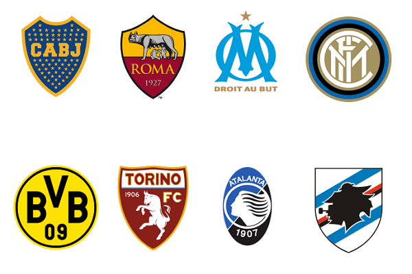
No.1 Boca Juniors Argentina

Simple. Classic. Identifiable.
Those great chunky initials. The lovely colours. And all those stars - each one representing a domestic or international title won by the club.
There have been some other great designs throughout the Boca Juniors crest evolution, but this most recent offering is our favourite.
No.2 Sampdoria Italy
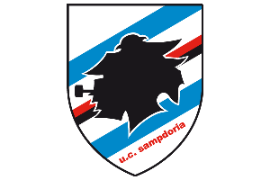
Ah yes, Sampdoria, not only associated with some of the most classic football kits around, but also one of the most iconic crests.
Club colours? Check.
Famous stripe? Check.
A nod to Genoa's maritime heritage with the outline of a sailor called 'Baciccia'? Check.
Thankfully, as the Sampdoria crest evolution shows, the club has resisted the urge to tinker with the design. Fingers crossed it stays that way.
No.4 Chesterfield England
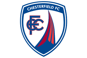
We like the intertwined CFC letters and the colours. But what we really love is the Derbyshire town's unique symbol, the crooked spire, which also lends itself to one of the best football club nicknames around - the Spireites.
No.5 Santos Brazil
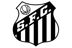
Classic South American design... Shield. Stripes. Initials. Retro ball.
No.6 Roma Italy

This is the retro Lupetto ("little wolf") crest, first used on kits in 1978, through until 1997. It's brilliant.
No.7 New York Cosmos USA
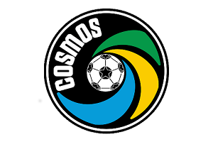
What a logo - it just screams the 1970s with those colours and the swirl effect.
The club has been reformed with a similar crest but it doesn't beat this original one from 1977.
No.8 Sporting CP Portugal
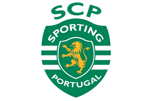
Love the white stripes cutting across the green shield.
They're known as the Leões (Lions), hence the symbol.
No.9 Marseille France
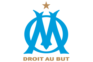
Crest simplicity in 3 steps:
1. Take an "O".
2. Superimpose it over an ornate "M".
3. Add motto Droit au But ("Straight to the Goal").
To be fair their have been a few variations to this monogram through the Marseille crest evolution, but this most recent design is probably our favourite of all of them.
No.10 Hamburger SV Germany
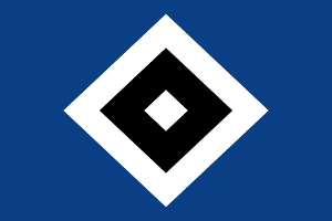
Now this, is controversial.
Many people really dislike it because it doesn't actually mean anything.
But we embrace it's iconic simplicity.
No.11 Hellas Verona Italy
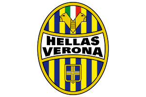
The club colours. The city's emblem. And two mastiffs which represent the club's nickname "I Mastini". Hellas Verona's crest is a cracker.
No.12 1. FC Köln Germany
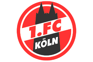
The whole goat-on-cathedral thing really shouldn't work. But it does. Brilliantly.
No.13 FC Basel Switzerland
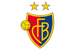
An old fashioned look and feel but all the better for it, especially the use of FC Basel's club colours.
No.14 Crvena Zvezda / Red Star Belgrade Serbia
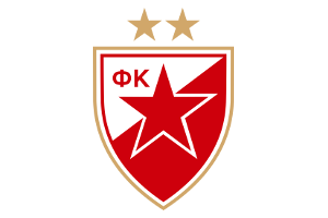
A thing of beauty. Not only is Red Star Belgrade one of the classic club names of European football, but their badge is one of the continent's best too. And it does exactly what it says on the tin - that large red star making it instantly recognisable.
No.15 Fluminese Brazil

The classic look of the intertwined-club-initials that's so popular in many Brazilian football club crests.
No.16 Dukla Prague Czech Republic
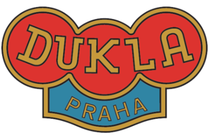
One of the great names of East European club football, and a uniquely shaped badge.
No.17 Ajax Netherlands
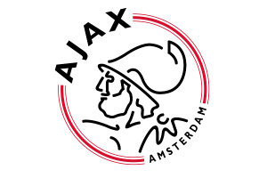
Instantly recognisable as the badge and colours of the Dutch giants. The Ajax crest evolution saw it go from the classic design that had adorned the shirt in the 1970s and 80s to this more modern take on it in 1990.
And what's the story with the head? It's an ancient Greek hero called Ajax, drawn using 11 separate lines to represent each of the players in the team.
No.18 Sheffield United England
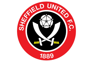
They're from the steel city.
They're nicknamed the Blades.
They play in red and white.
It all works pretty well.
No.19 Torino 1983-90 Italy
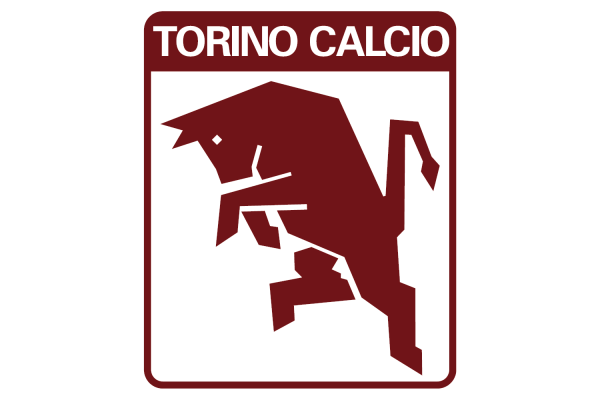
Great bold shape & design. Lovely maroon colour.
The bull is the symbol of Turin, as well as the club.
Bellissimo!
This is undoubtedly the finest of their badges, but have a look at the Torino crest evolution for the other designs that have been used over the years.
No.20 1. FC Kaiserslautern Germany

Nothing much going on here, but we just love the chunky club initials against that red background.
No.21 Saint-Étienne France
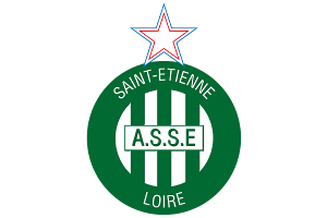
A quick look at the Saint-Étienne crest evolution shows that, apart from their flirtation in the 1970s with the black panther design, the French club have kept their badge simple. Simple, but classic. And this crest is just that. The club name, its initials, the green and white stripes, and even the city's region, all make it onto the latest crest, topped off with a tricolour star.
No.22 Club Atlético Belgrano Argentina
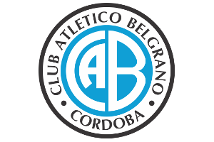
One of our favourites, so much so that it inspired one of our CF Classics logos. The colours are great, but it's the way that the "A" fits inside the "C" that we really love, in that classic South American style.
No.23 Atalanta 1981-93 Italy

Another iconic badge, and pretty unique. So, whilst Ajax are named after a mythological Greek hero called "Ajax", Atalanta are named after a heroine of Greek mythology, and it's her head and flowing hair that appear on the crest.
The most recent design in the Atalanta crest evolution is quite similar, but we love the simple circular shape of the 1980s version.
No.24 Borussia Dortmund Germany
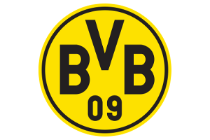
Another in the category of so simple, but it works. There's not much to it, and throughout the history of the Borussia Dortmund crest evolution it's hardly really changed, but that's probably why it's so instantly recognisable and associated to the club.
No.25 Huracán Argentina

The Buenos Aires club takes it's name and crest from the Huracán ("Hurricane") balloon flown by the Argentine aviator Jorge Newbery in 1909. There are some fantastic Argentinian football club crests, and this is certainly one of the most iconic.
No.26 Palmeiras Brazil
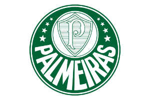
Brilliant crest from the São Paulo club, really unique with the enormous lettering of the club name going around the bottom.
No.27 Paris Saint-Germain 1996-02 France

No matter what you think of Paris Saint-Germain, this is a great looking badge.
Most of their designs over th eyears have obviously incorporated the Eiffel Tower but there are a couple of different designs in the Paris Saint-Germain crest evolution, including a classic from the mid 1980s.
Tweet