The Evolution of the Inter Crest
1908-1928
1928-1929
1929-1932
1932-1945
1945-1960
1960-1962
1962-1963
1963-1966
1966-1978
1978-1988
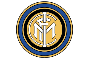
1988-1998
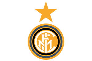
1998-2007
2007-2014
2014-2021

2021...
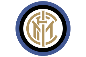
Inter Crest 1908 to 1928
The first Inter crest was actually designed by one of the club's founders, Giorgio Muggiani. His monogram design consisted of the letters FCIM, the four initials of the club's official name, Football Club Internazionale Milano. Muggiani also incorporated the club's colours, black and blue, into the surrounding rings.
This initial monogram design has proved the basis for many of the crests throughout the club's history. As football crests go, it's a thing of beauty.
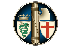
Inter Crest 1928 to 1929
In 1928, the country's ruling fascists forced the club to drop the name Inter, made them merge with Unione Sportiva Milanese, and renamed them as Società Sportiva Ambrosiana. Ambrosiana was a reference to the patron saint of Milan, Ambrose.
With the new club name came a new crest. It featured two symbols of Saint Ambrose and Milan - a red cross shield and the Visconti Biscione (a serpent consuming a human).
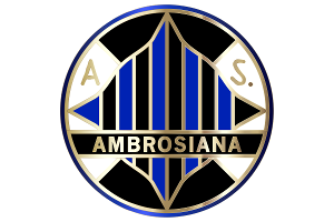
Inter Crest 1929 to 1932
In 1929, new club president Oreste Simonotti decided to change the club name again, to Associazione Sportiva Ambrosiana. The crest was also re-designed, "Ambrosiana" now featured heavily, blue and black stripes colours were included, and the two coat of arms dropped.
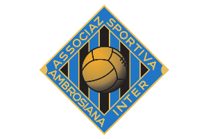
Inter Crest 1932 to 1945
Despite the fascist regime ordering the Inter name to be dropped, the club's fans had continued to call the team Inter. In 1932, under pressure from the supporters and club members, the new president changed the name again to reflect this, and the club was renamed to Associazione Sportiva Ambrosiana-Inter.
Another name change meant yet another crest change, the black and blue stripes remained but everything else was altered, from a circular design to a square with the new club name along the edges, and with a football symbol added.
Inter Crest 1945 to 1960
The end of World War II in 1945 also meant the end of the ruling fascist regime in Italy, and this resulted in the club being able to revert back to its original Internazionale name, And its original crest. However, they did modify it slightly with the colours of the letters and background reversed.
Inter Crest 1960 to 1962
The start of the sixties saw a radical change to the Inter crest, and it wasn't for the better!
Gone was the iconic monogram style, and in was a shield, split into three sections, with the club's black and blue stripes on one side, the return of the Biscione with the club's formation date on the other side, and the FCIM initials on the top.
Inter Crest 1963 to 1966
1963 saw a welcome return to the original monogram-style crest, albeit with a more intricate design, including more rings and more use of the gold colour.
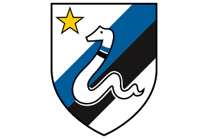
Inter Crest 1978 to 1988
1978, and Inter went radical again, but this time we loved it.
Maybe they'd got wind of what Roma were up to with their iconic 1978 Lupetto crest design, because Inter went along a similar design route, creating a modern representation of one of the city's emblems, in Inter's case the Biscione serpent. The Biscione was placed on top of diagonal black and blue stripes, in a shield with a star to represent the ten Serie A titles that Inter had won. It was completely different, but it looked great, and became an iconic late 1970s/80s football crest.
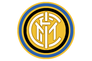
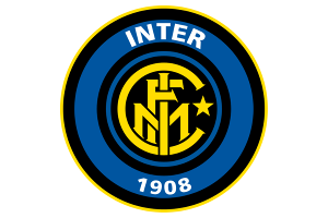
Inter Crest 2007 to 2014
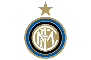
2007, and the star is back on top of the crest, whilst the style and colouring is pretty similar to the original 1908 design.
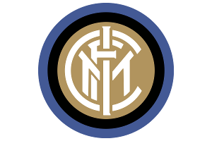
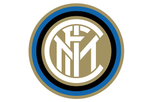
Inter Crest 2014 to 2021
Inter Crest 2021 to Now
2021 saw the most controversial change to Inter's logo as the club followed the trend that had been taken by Juventus a few years earlier in creating a radically simplified logo. Gone are the FC letters and the gold trim, leaving just a bold IM on a blue background with a black border. To us, the previous badge was simple enough, so it's a shame they felt the need to make it even more minimalist. Let's hope that they return to the old style in future years...
Tweet


