The Tournament Logos of the World Cup



THE WORLD CUP LOGOS - IN DETAIL

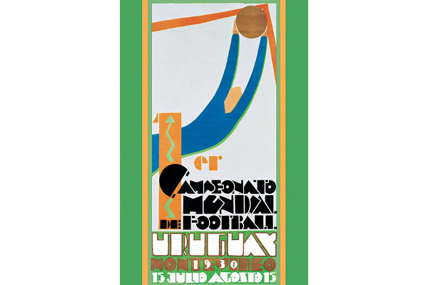
No.1 1930 Uruguay.
The first World Cup had no official logo but the poster used was a fantastic abstract-style design. Just check out that keeper plucking the ball out from the top corner. Superb. If anything immediately demonstrates that World Cup posters can make great football artwork it's this!

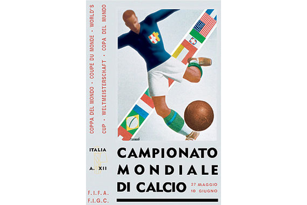
No.2 1934 Italy.
Another poster, with the Italians adopting a more traditional look for the second World Cup, but a very effective design nonetheless.

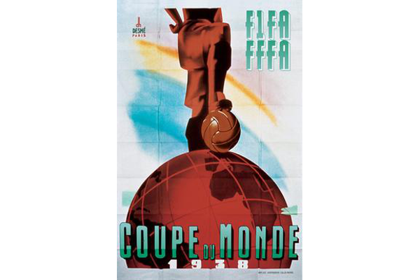
No.3 1938 France.
Brilliantly bold art-deco poster from the French. The boot, on the ball, on the world. And all finished off with that great big chunky COUPE DU MONDE.

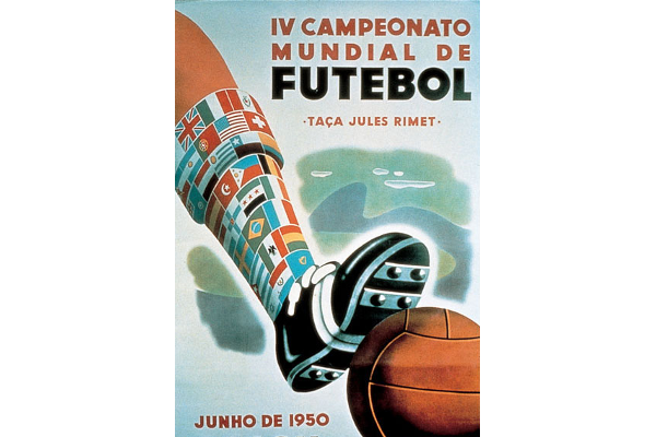
No.4 1950 Brazil.
The last of the poster-style designs sees the Brazilians go for the classic flag-sock look! It shouldn't work. But it does.

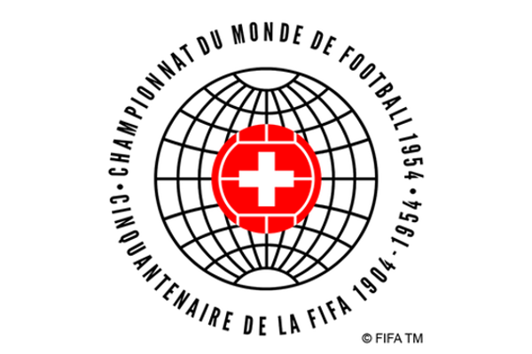
No.5 1954 Switzerland.
The fifth World Cup saw the Swiss attempt the first simple logo. A combination of globe, football and Swiss flag.

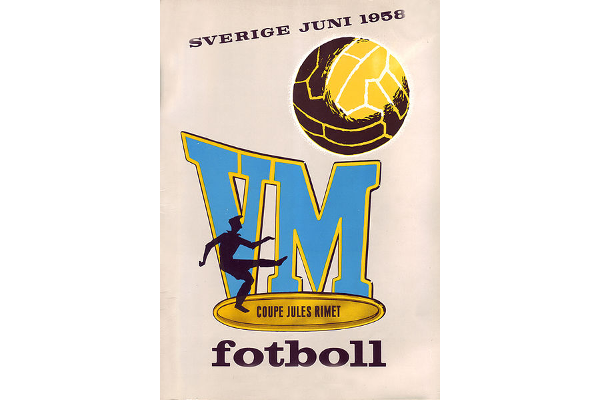
No.6 1958 Sweden.
Back to the tried and tested poster look for the 1958 World Cup. We might argue that it's also promoting the 'route one' brand of football for northern Europe.

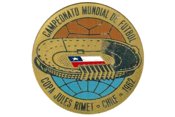
No.7 1962 Chile.
Half a ball, half a globe, a stadium, and a flag. Job done.

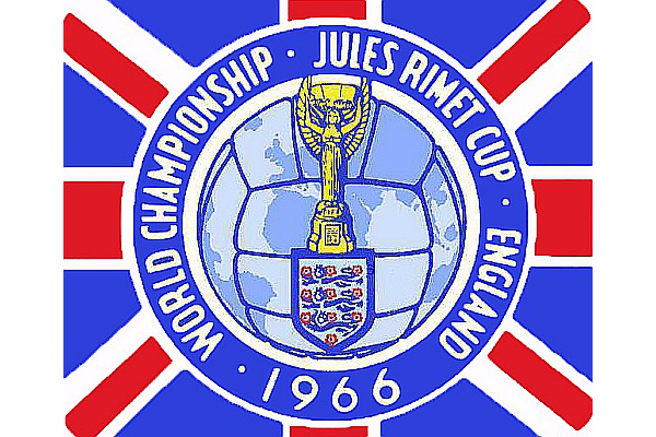
No.8 1966 England.
The Jules Rimet trophy pops up in the 1966 logo. Still gleaming nicely in front of a retro ball and a Union flag.

No.9 1970 Mexico.
The first official FIFA World Cup logo. And what a logo. That brilliantly simple ball design and that amazing font. Totally Iconic.

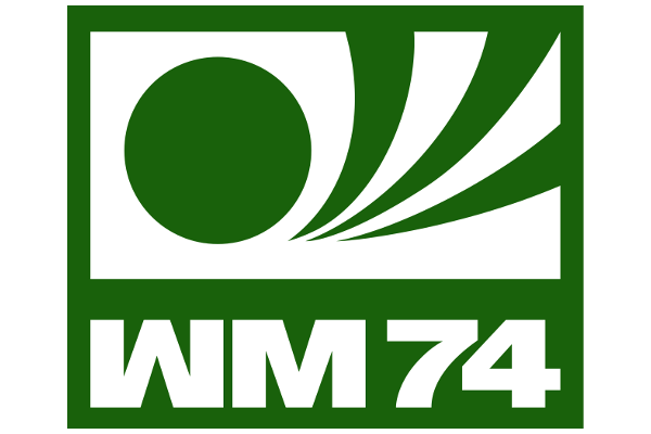
No.10 1974 West Germany.
Okay, so it's certainly no Mexico 1970, but it still has a certain appeal with the massive chunky lettering.

No.11 1978 Argentina.
Another iconic logo with a Telstar-style ball fitting in with the colours of the host nation.

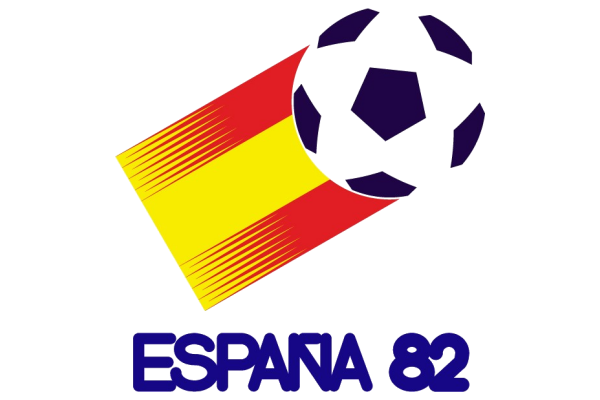
No.12 1982 Spain.
This was a great design from the Spanish. Shame they didn't go for an adidas Tango for the ball though...

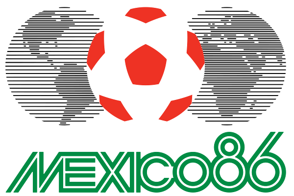
No.13 1986 Mexico.
It's not as good as their design from 1970, but it's another memorable World Cup logo from Mexico. Great lettering again too.

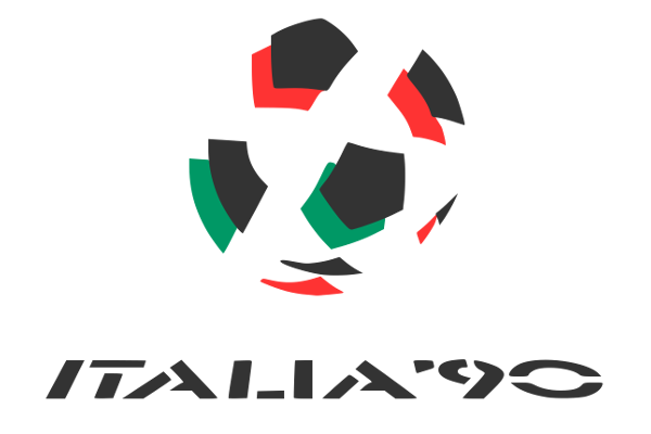
No.14 1990 Italy.
The Italians played it nice and simple here. A ball design in their national colours.

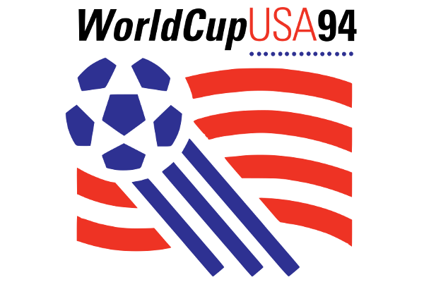
No.15 1994 USA.
A clever ball and stripes design from across the pond. Does what it says on the tin.

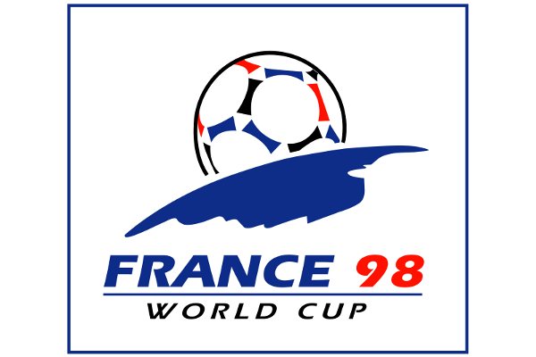
No.16 1998 France.
Pleasant enough. We think it was supposed to represent a ball rising above the Earth.

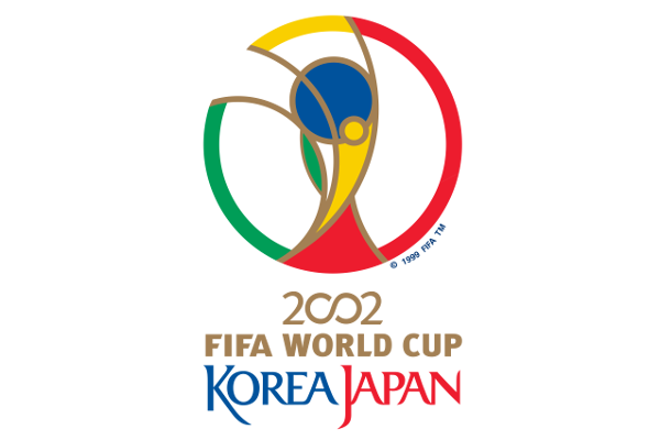
No.17 2002 Japan/S.Korea.
2002 saw the start of more complex logos. This wasn't exactly memorable but was certainly better than their terrible mascots!

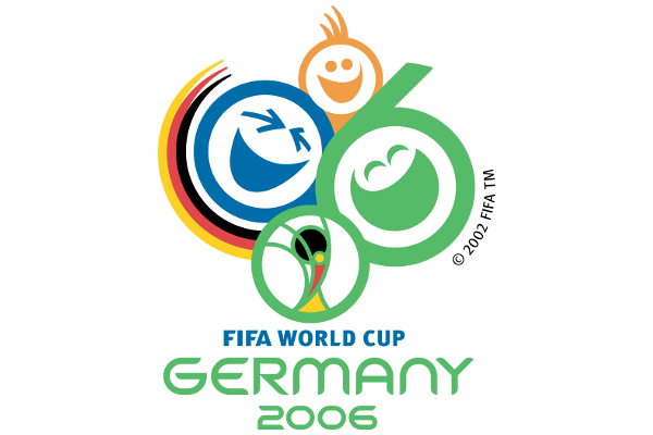
No.18 2006 Germany.
The hosts wanted to give off a friendly image so incorporated smileys into an "06" for their logo. We certainly remember it, so it obviously did its job.

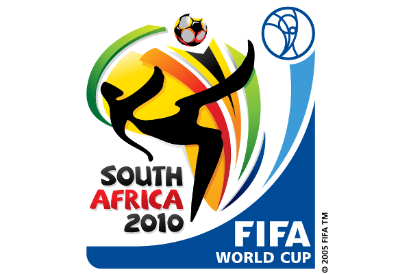
No.19 2010 South Africa.
This had a bit of everything in it. A bit too much in our book though. Long gone were the simple designs of the 1970's and 80's.

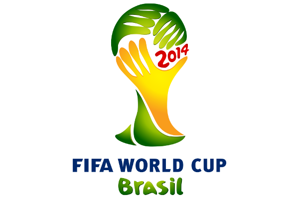
No.20 2014 Brazil.
Three hands, in the Brazilian colours, combining to form the famous FIFA World Cup Trophy.

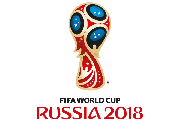
No.21 2018 Russia.
This "magic ball" apparently pays homage to Sputnik, Fabergé eggs and the Red Square's Cathedral. To be fair it grew on us during the tournament.

No.22 2022 Qatar.
Tweet
