World Cup Posters
THE WORLD CUP POSTERS - IN DETAIL
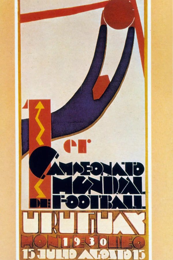
No.1 1930 Uruguay.
To be fair, the first ever World Cup poster was an absolute blinder, and has been hard to follow ever since. Someone has placed that ball absolutely top bins, but look at that keeper stretching everything to keep it out! A beautiful work of art that set the bar extremely high for all of the other posters to follow.
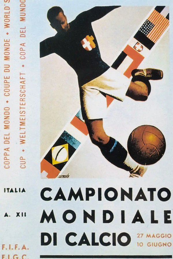
No.2 1934 Italy.
Created by Italian illustrator Gino Boccasile, it's another decent poster with a big, bold design. However, it's somewhat tainted by the fact that Boccasile became a supporter of Benito Mussolini and helped produce propaganda material for his government.
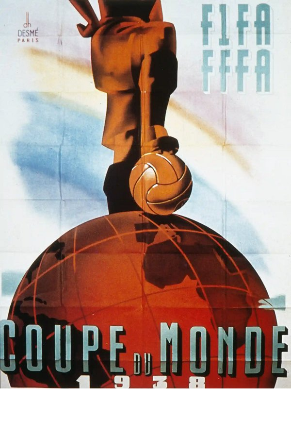
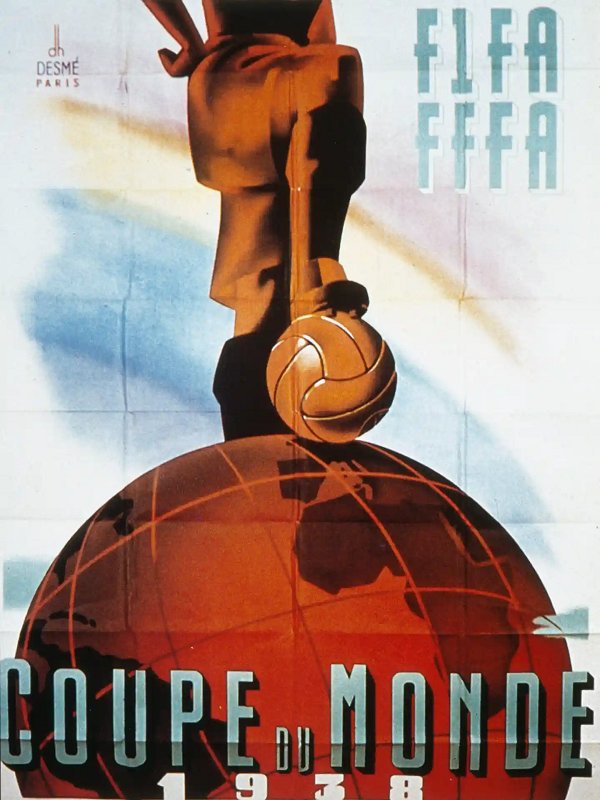
No.3 1938 France.
Great art-deco style poster from France. The massive "Coupe du Monde" lettering at the bottom and then the huge world globe rising up with the ball and boot resting on it. Surely if you'd been in any doubt beforehand, then seeing a poster like this would have made you want to go to this tournament!
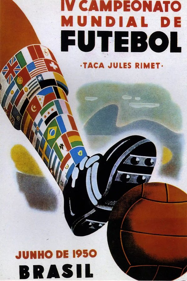
No.4 1950 Brazil.
Brazil carried on where France left off, with the old foot-on-ball idea. The whole sock-made-from-flags thing really shouldn't work, but for some reason it sort of does.
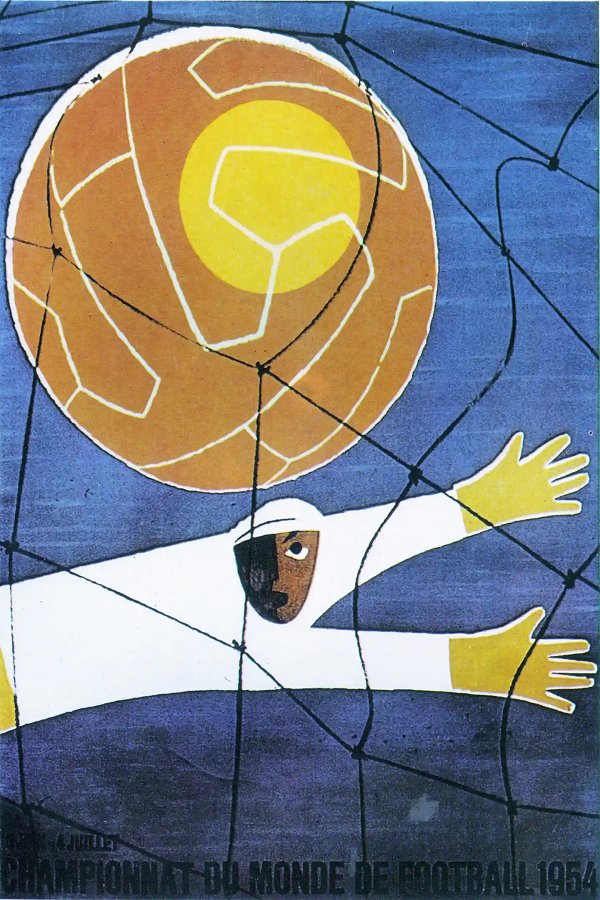
No.5 1954 Switzerland.
Switzerland's 1954 design saw them go back to the despairing dive of a goalkeeper, which had served the first World Cup so well. However, this one always reminded us of a kids book cover, rather than a World Cup poster.
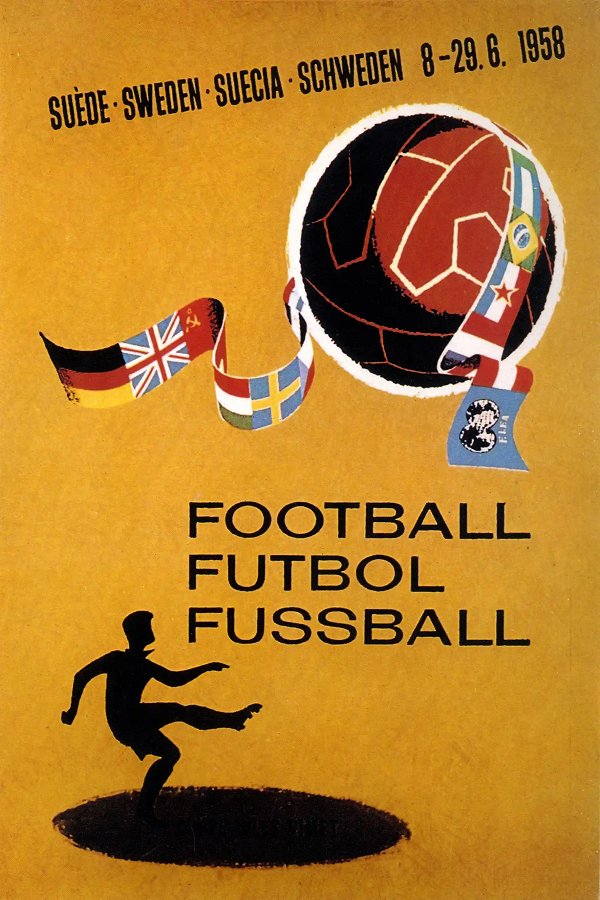
No.6 1958 Sweden.
A few flags, a footballer, and a large ball, made up the basis of the Swede's design for the 1958 World Cup. Not amongst the top posters, although we did like the use of the words Football, Futbol and Fussball.
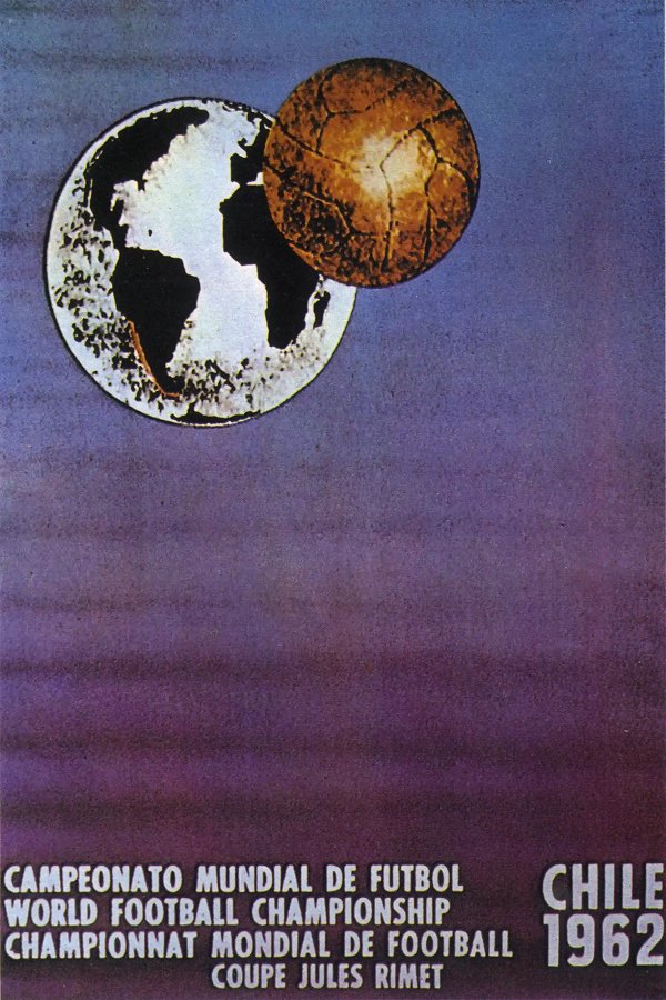
No.7 1962 Chile.
A bit of an odd one this poster, with a giant football orbiting the earth. And apart from the wording at the bottom, the only reference to Chile was the faint red mark on the map highlighting the country.
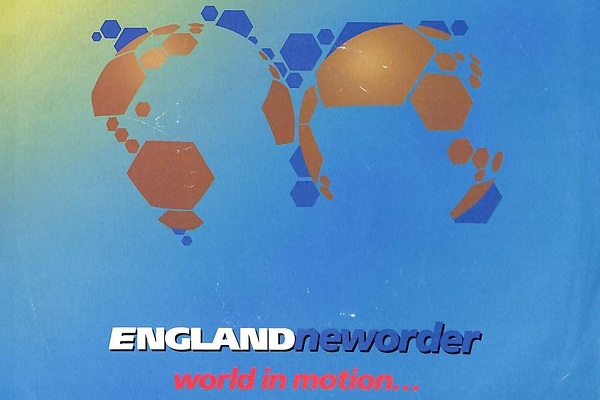
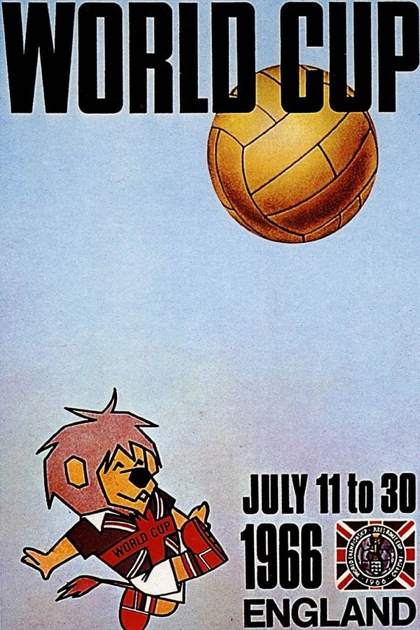
No.8 1966 England.
England's design in 1966 was the first to also feature the official mascot, as World Cup Willie volleys a ball high up into the poster.
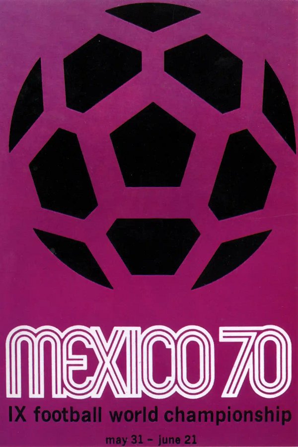
No.9 1970 Mexico.
Not sure if there is anything specifically Mexican about this poster, but that ball and that font have become so iconic that it remains one of football's greatest pieces of artwork, inspiring plenty of other designs, including one of our very own CF Classics logos.
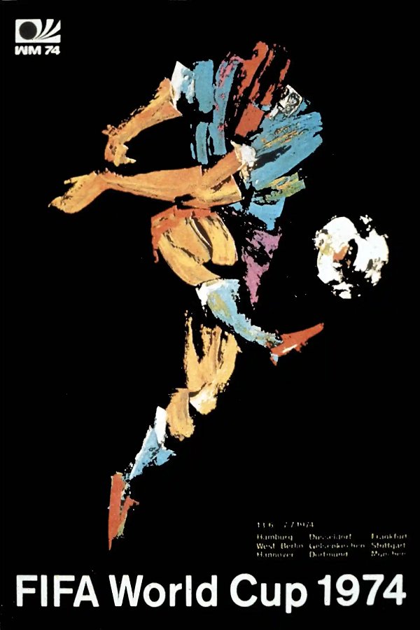
No.10 1974 West Germany.
Another cracking poster, this one by German artist Horst Schäfer. Some people have said that the head looks a bit robotic or alien, but so what? Instead, look at the power in that shot from those enormous Gerd Müller-esque thighs!
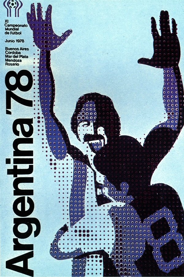
No.11 1978 Argentina.
A great poster. The huge vertical text, the halftone graphic technique on the two Argentina players. What's not to like?
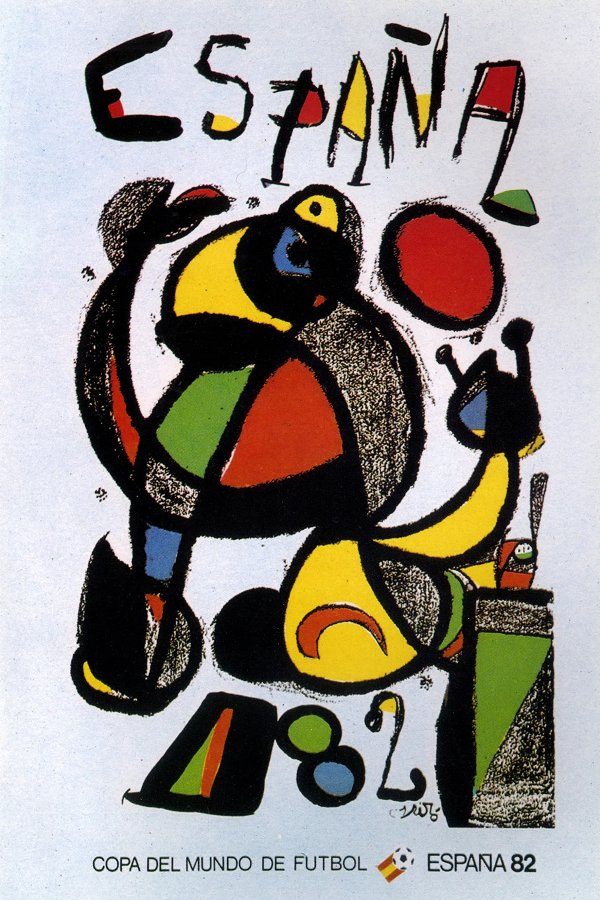
No.12 1982 Spain.
Painted by the acclaimed Catalan surrealist Joan Miró, this is about as Spanish as art gets. However, as a football poster it's missing something - the football. Unless we're missing something, which I suppose with surrealism is entirely possible.
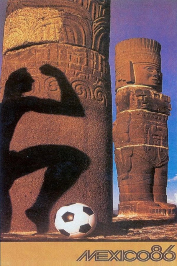
No.13 1986 Mexico.
We're not huge fans of the Mexico '86 poster, especially when compared with that iconic beauty from Mexico '70. Commissioned by American photographer Annie Leibovitz, our problem with it is that it's too much like a photograph, rather than a traditional graphic-style poster.
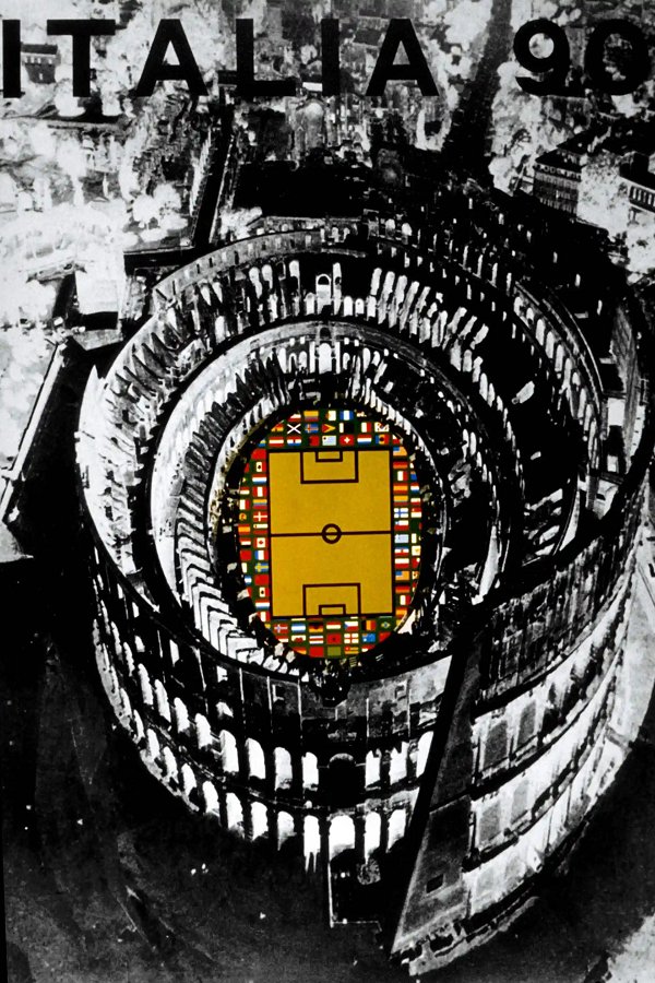
No.14 1990 Italy.
There's a real darkness to the 1990 poster, you sometimes don't even notice the Italia '90 wording at the top. But it still looks cool, especially with the splash of colour in the Colosseum acting as the pitch.
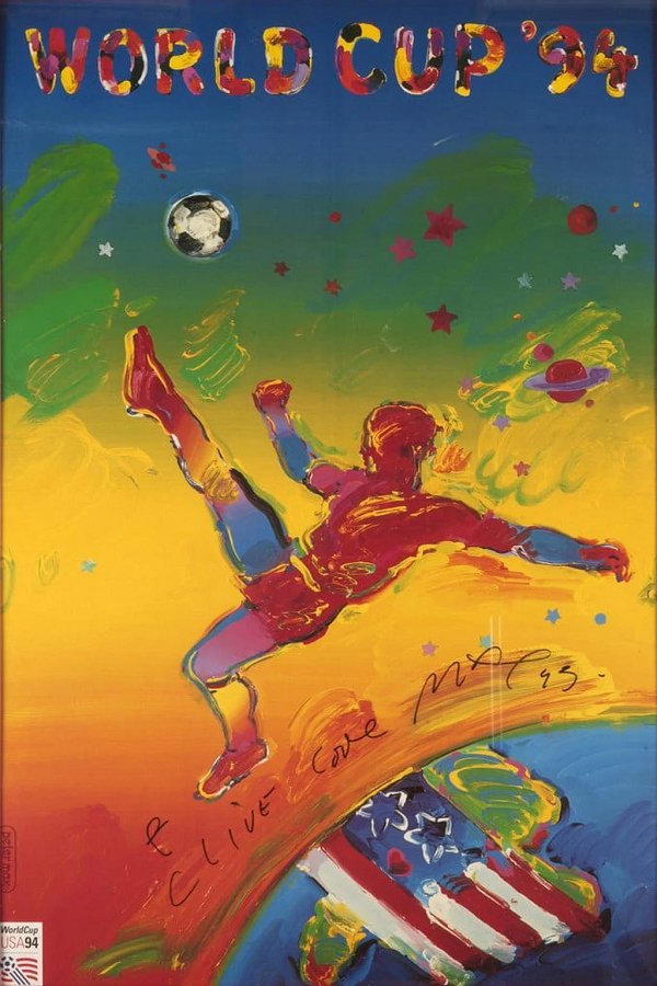
No.15 1994 USA.
Created by New York artist Peter Max, it's not one of our favourites - it's a bit wishy-washy and there's nothing really exciting about it.
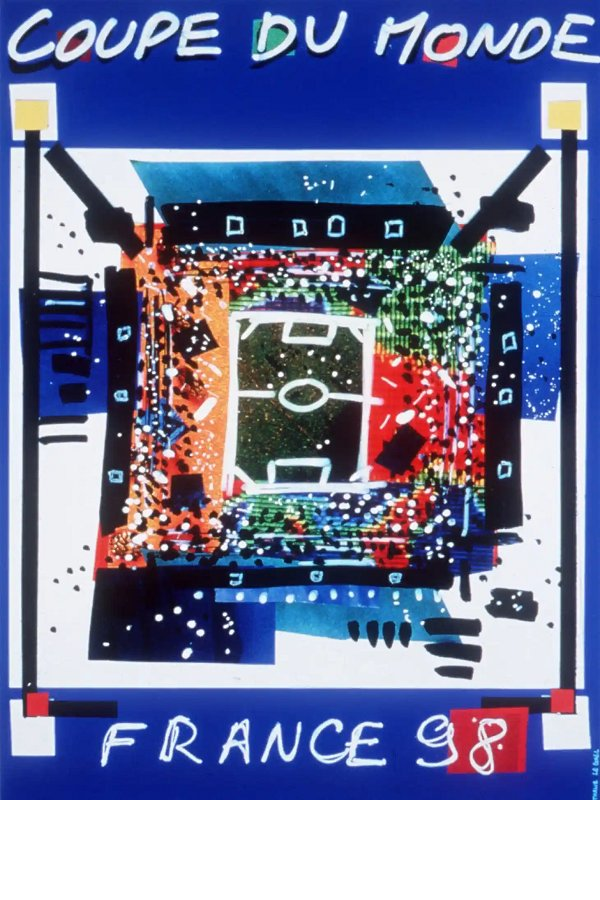
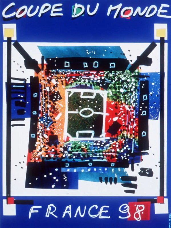
No.16 1998 France.
With a reputation as one of the traditional home's of art, big things were expected from the French design, but its simple stadium design was by no means a classic and definitely nothing memorable.
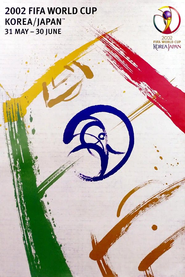
No.17 2002 Japan/S.Korea.
How to create a World Cup poster in two days: (1) slap down half a dozen or so lines with some random coloured paint to represent the pitch markings, then (2) quickly slap on some more paint to make the tournament logo the centre circle. Job done! It was a co-production by Korean artist Byun Choo Suk and Japanese artist Hirano Sogen. Apparently the strokes of each artist "represent the speed, drama, agility and skill of football". Hmmmm...
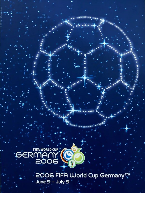
No.18 2006 Germany.
A poor effort from the Germans. For a start, it doesn't make us think about Germany whatsoever - why has it been set in space with some sort of star system representing a football? It's not fit to clean the boots of their 1974 World Cup poster.
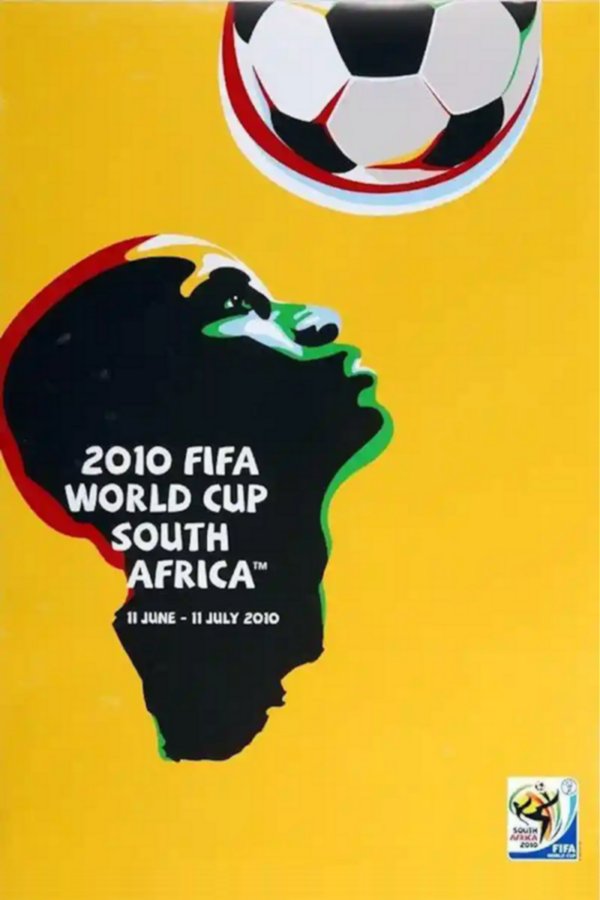
No.19 2010 South Africa.
This was the best poster for a while. Very clever, creating the face from the shape of Africa, preparing to head the ball. Great use of colours too.
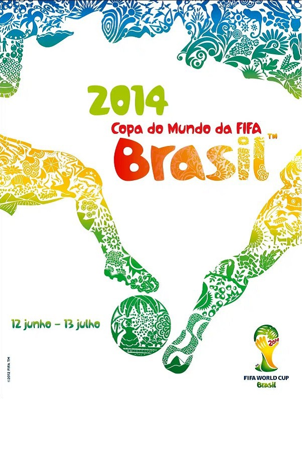
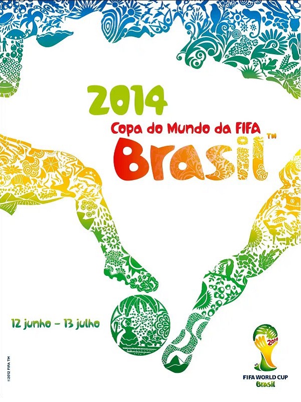
No.20 2014 Brazil.
Brazil decided to follow suit from South Africa with their design in 2014 and created an outline of the country from the human body - using a couple of footballer's legs and a football to form the bottom half of the shape. The end result was not as good as South Africa's.
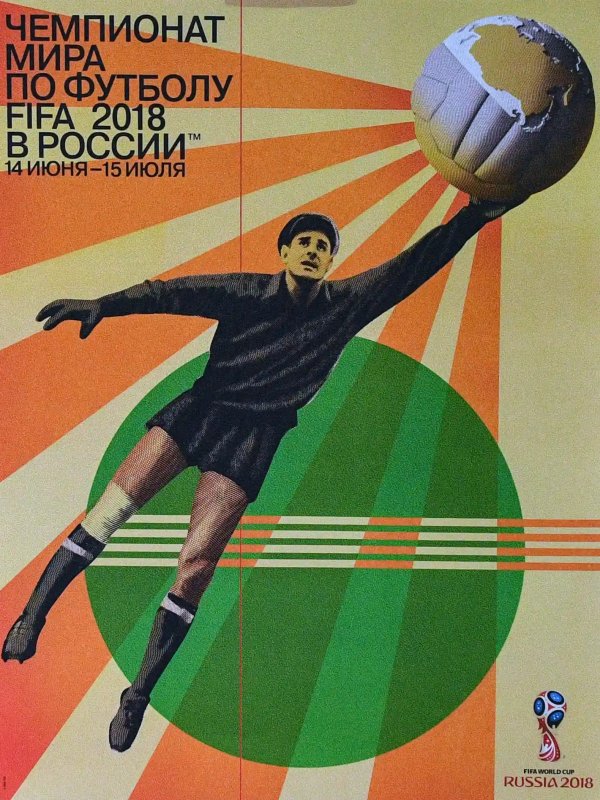
No.21 2018 Russia.
A bit of retro-inspired brilliance from the Russians with this magnificent poster. Featuring their legendary goalkeeper Lev Yashin, it's a real throwback to a proper vintage-style poster. Hopefully future World Cups will take note and also produce such great designs...
Tweet