The Evolution of the Roma Crest
1927-1930
1930-1934

1934-1937

1937-1942

1950-1960
1960-1977

1978-1979

1980-1991

1991-1992

1992-1996

1996-1997

1997-2013

2013-2017

2017-
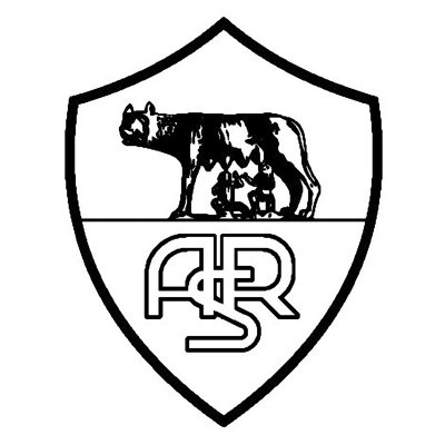
Roma Crest 1927 to 1930
Roma's first crest is one that the club has used in numerous forms over the years and one of the symbols of the city of Rome itself, that of two infant brothers called Romulus and Remus alongside a she-wolf. Placed inside a shield with the club initials, this unique image makes it one of the world's most memorable, and iconic, football crests. The wolf has remained a huge symbol of club throughout its history and lead to one of its nicknames "I Lupi" (The Wolves).
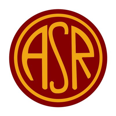
Roma Crest 1930 to 1934
In 1930 the club went to a simplified badge, using the club initials ASR in a circular design. The ASR standing for Associazione Sportiva Roma. The design also used the club's colours, dark red and golden yellow, the traditional colours of the city as well as the club. These are two of most iconic Italian club colours and form the basis of the majority of subsequent Roma crests.
Roma Crest 1934 to 1937
1934 saw a return to the use of Romulus and Remus, albeit more colourful than the original crest.
Roma Crest 1937 to 1942
Three years later, in 1937, and Roma returned to the club initials again, this time with an intertwined effect that was popular in club badges at the time.
Roma Crest 1950 to 1960
1950 saw the club display the word Roma for the first time on the emblem.
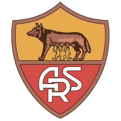
Roma Crest 1960 to 1977
A decade later and Roma returned back to the Romulus and Remus she-wolf design, but with a modified ASR.
Roma Crest 1978 to 1979
Whilst some clubs are in the "if it ain't broke, don't fix it" camp, and haven't really changed the basics of their design (see the Borussia Dortmund crest evolution), Roma have never been afraid to mix things up and try something different. So, 1978 saw Roma adopt another iconic emblem - the 'Lupetto' design by Piero Gratton. Roma owner Gaetano Anzalone wanted to improve the club's marketability and recognised that the existing Romulus and Remus design was not just associated with the club, but with the city of Rome as well, so he asked Gratton to design something specific to the club. Gratton stuck with the club colours and wolf symbol but created a radical contemporary design, and one that looked absolutely magnificent on those club shirts. It was known as the 'Lupetto', meaning little wolf.
For us, this is our favourite of the 1970s football crests, and is undoubtedly one of the greatest football crests ever.
Roma Crest 1980 to 1991
A couple of years later and the Lupetto badge was altered slightly, with 'as roma' being added. Even this looked cool though, as Gratton created the text using the Helvetic Medium font but merging the 'as' together.
When paired up with Ennerre, the classic Italian kit manufacturer, and Barilla, one of the classic kit sponsors, it made one of the best looking shirts ever.
Roma Crest 1991 to 1992
The start of the 90s saw the circular-shaped crest dropped and the Lupetto figure and "as roma" are left to stand out on their own. The colour was also changed to golden yellow.
Roma Crest 1992 to 1996
One year later and the Lupetto crest gets another change - the "as roma" is dropped and the colour changed again.
Roma Crest 1996 to 1997
1996, and the "as roma" is back on the crest, and a shield is also added to the design.
Roma Crest 1997 to 2013
As huge fans of the iconic Lupetto design, 1997 was a very bad year for us, as Roma went back once more to the Romulus and Remus design. Yes, it's still a fine badge but it's also associated with the city itself, what we love about the Lupetto is that it's unique to the club. Anyway, they decided to go back to it, and it was very similar to the original 1927 design, but with colour.
Roma Crest 2017 to now...
In 2017 Roma tweaked the crest again, changing a few of the colours, although the design remained fundamentally the same.
Tweet


