The Evolution of the Torino Crest
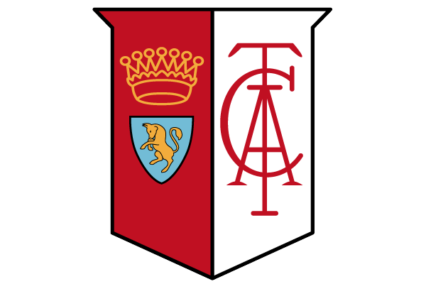
1936-1946
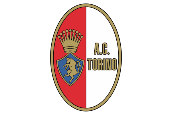
1959-1977
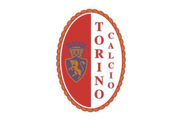
1977-1980
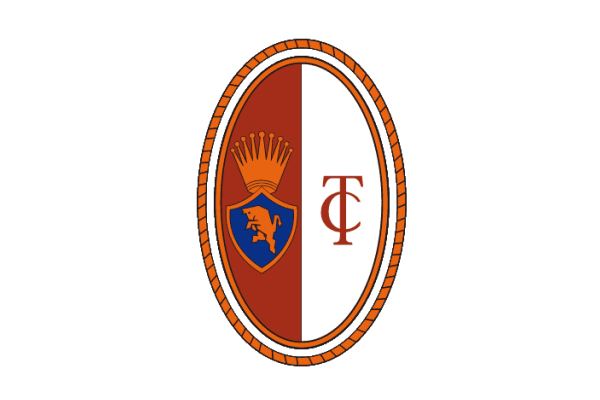
1980-1983
1983-1990
1990-2005

2005-now
Torino Crests 1936 to 1983
The common theme throughout the evolution of Torino's crest is the rampant bull, the symbol of the city of Turin. The Grande Torino was the name given to the team in the club's greatest priod, the 1940s. This period saw the club win five Serie A titles in seven years until tragedy struck in 1949 with the Superga air disaster that saw all thirty one people die in a plane crash on the outskirts of Turin, killing players, coaching staff, club officials, journalists and flight crew.
In the 1970s the crest was simply the silhouette of a bull.
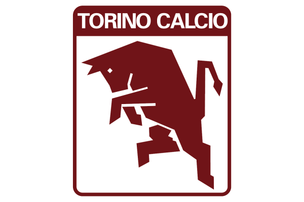
Torino Crest 1983 to 1990
1983 saw Torino create one of the best 1980s football crests, if not one of the greatest football crests of all time. Torino got marketing company GBM Italia to create the new logo, wanting a bold, stylish look that also gave an image of determination and aggression for which they believed the club was well known. And GBM Italia delivered. Not only is the crest much loved by Torino fans but fans of retro football across the world.
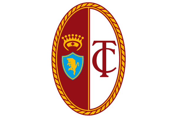
Torino Crest 1990 to 2005
As is often the case, after just seven years the club decided to swap the iconic modern design and revert back to the oval design. The two designs were about as radically different as possible. The 1990s saw a mini resurgence for the club, coming agonisingly close to winning the UEFA Cup in 1992 and then claiming the Coppa Italia in 1993.
Torino Crest 2005 to Now
2005 saw another change, and this one for the better. Whilst we still prefer the 1980s crest, this is still an absolute belter, a really bold design that is instantly recognisable in the football world.
Tweet


